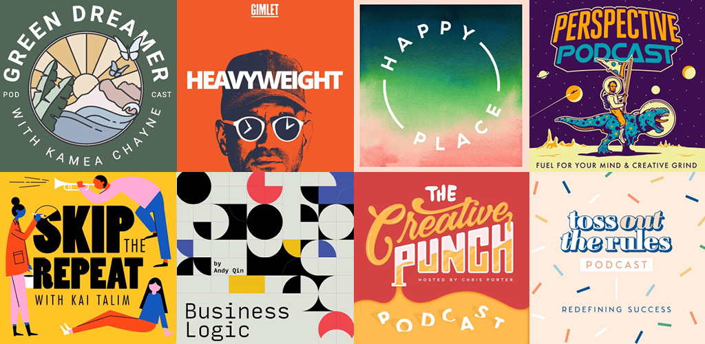
Your podcast’s visual identity is just as important as its content. Try seven tips to make your podcast covers stand out from the crowd.
While we often abide by the expression, “Don’t judge a book by its cover,” in life, it simply doesn’t apply to online thumbnails and cover art. To put it plainly, there’s just so much content out there, you really do need something that’s going to stand out and incentivize your audience to stop scrolling.
In the podcast world, listeners typically scroll through a library or category of different podcasts. They may search for a topic they’re interested in, then glance through what’s available.
The first thing listeners pay attention to is a podcast’s cover design. If a podcast has a stunning cover design, one can assume that it speaks to the quality of the podcast itself. People will begin making their judgments and assessments of your work the second they see the cover art.
While the podcast content itself keeps those listeners coming back for more, the cover art acts as the “hook” for new listeners. In order for people to subscribe or keep coming back, there needs to be a reason to stick around—so the podcast itself needs to be that of quality.
For more on how to create and record a professional sounding podcast, check out our deep dives on the subject below.
Now that we know the importance of a podcast’s graphics, how do we make them truly stand out? Read on to find seven expert tips to give your podcast that essential visual boost.
Tip #1: Study Your Competitors
Before embarking on your podcast cover design journey, take a look at your competitors. Get an idea of how they approach thumbnail design, from the imagery to the color palettes to the typography. Use this time to get some creative inspiration, learn about who you’re up against, and see who’s dominating different categories.
While you may think the move is to emulate the chart-topping podcasts in your field, we’re going to talk about how to study their presentation and apply some of those principals to your own work.

The best way to approach this is to scroll through specific genres, whether it’s education, health, or business. Take note of the podcast covers that stand out to you and find out why.
One method I’ve tried out is to open Apple Podcasts or Spotify and click on a genre or section that’s completely random, start scrolling, and wait till something catches your eye.
From there, you can study the cover art to figure out what about it stood out to you? Is it the color combination? The unique typographic placement? Write down what it is that speaks to you and apply it to your own podcast cover design.
Just make sure the colors and overall aesthetics fit the subject matter that your podcast covers.
Tip #2: Get Your Dimensions and Specs Correct
The size of your design truly does matter. For your podcast cover to be viewable across multiple platforms, the cover design needs to follow specific image guidelines and dimensions.

The best place to start is to ensure your cover design fits within the parameters set by Apple Podcast. As of writing this article in January of 2022, the images uploaded in this platform must adhere to a minimum dimension of 1400 x 1400 pixels or a maximum of 3000 x 3000 pixels. Podcast art should always be designed in a 1:1, or square, format.
Once you’re ready to export your design, set the export to a screen resolution at 72 DPI. File formats should be set to a PNG or JPG for best image compression displays.
Tip #3: Convey Your Podcast’s Message
A cover design should encapsulate the entire theme or topics discussed on the podcast with the help of graphics, color, and typography.
If your podcast goes into detail about the health industry or about the brain, that message should be apparent in the design of your podcast cover.
Stick to iconography, colors, imagery, copy, and typography that supports your message.

While this applies to all visual components, it’s also crucial to come up with a title that resonates with the nature of your podcast. Stick to a few words maximum that effectively communicates what the podcast episodes may cover.
Avoid wording that’s too vague or too specific because people aren’t going to know what you’re about just by seeing some vague “cool looking” imagery that doesn’t apply to anything you’re making.
In the past, I’ve clicked on several podcasts because of their cover art and was disappointed with the actual product due to the misleading cover. I think most audiences are tuned into this aspect of browsing. So, like anything creative, just treat your audience with respect and try not to mislead.
Tip #4: Stick to Two Fonts or Less
Many designs warrant a typeface or two for getting a message across—a podcast cover is no different. Due to the smaller size of many podcast thumbnails, having three or more different typefaces can obscure the visuals and tone.

When choosing your typefaces for your podcast design, it’s crucial that the fonts work well together. By mastering the art of font pairing, you can easily take your podcast cover to the next level.
The best approach is to select two fonts that contrast each other. If you’re set on using a script font for the title copy, select a simple sans serif to accompany the script header. Take a font’s appearance and then find the exact opposite of it.
A geometric-style font is best paired with an organic font, and a bold font best accompanies a lighter weight one. If you’re unsure of what works for your design, simply create multiple variations of it with different typefaces, then work from there.
If you want a giant list of fonts available for downloading (for FREE), look no further than our comprehensive list of 101 fonts available to you right now.
Tip #5: Make the Visuals Stand Out
While we may say that we don’t judge a book by its cover, listeners certainly pay close attention to a podcast’s visuals when choosing from a library. First impressions are critical, and having an eye-catching thumbnail is the key to getting more listeners.

Entice your viewers by incorporating unique illustrations, typography, and imagery to your cover design. Think about how all elements of your composition pair with each other. Basic silhouettes and simple typography can often get lost with other podcasts.
Tip #6: Use Color Thoughtfully
Next to the overall visuals and typography, color is an important matter to take into consideration when designing your podcast cover. Having an essential knowledge of color psychology and theory is imperative to getting the correct tone, mood, and message across to your listeners.

The theme of your podcast should correlate to the hues used in your cover design. A neon color palette is not the best choice for a business podcast. Instead, opt for a harmonious palette that evokes professionalism.
However, avoid expected color choices when picking out hues. Having a predictable palette often means your cover art will blend in with competitors.
When working with colors, it can be daunting to test and decide which colors work best together. In all honesty, I’ve found myself having everything mapped out in my head, only to find that the colors just don’t work together once I’ve brought it all into Illustrator or Photoshop.
It’s a visual thing, you know? Don’t be afraid to try out new color combinations because you never know what will work.
Tip #7: Source High Quality Images and Vectors
A high-quality design goes a long way. It can easily differentiate your podcast from others, just in the visuals alone.
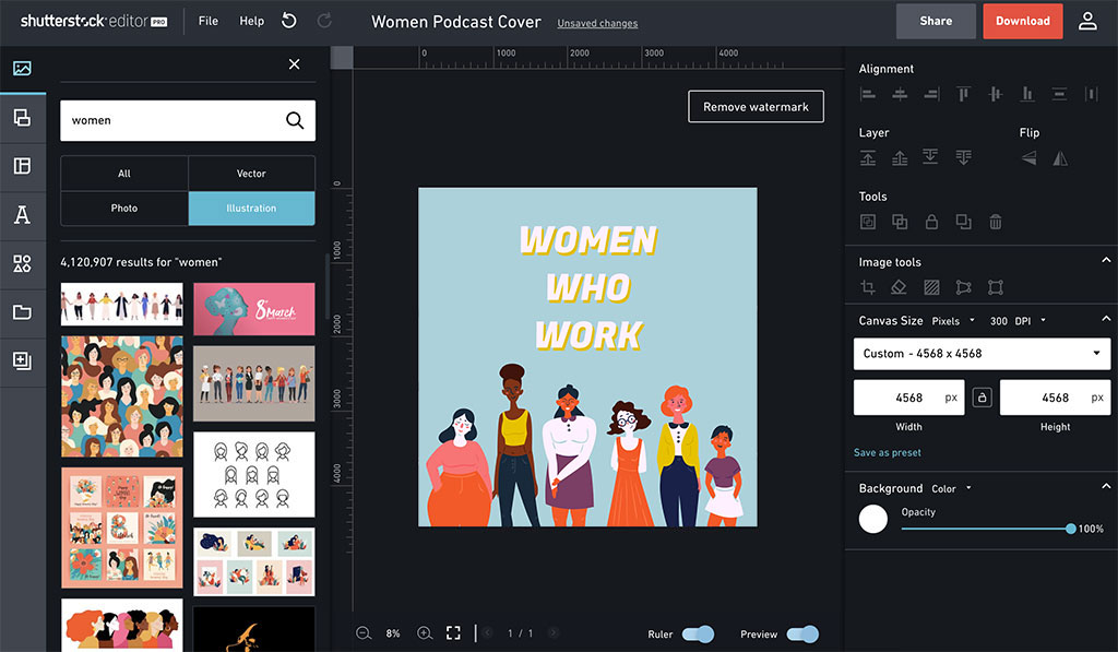
Lucky for you, Shutterstock features a vast library of high-quality vectors, photography, backgrounds, typography, and more. You can easily browse through all of these images in our free Shutterstock Editor program and apply them to your new podcast graphic.

In addition to our free program, we’ve also released dozens of FREE assets over the years. Anywhere between images, vectors, and full-on cover art. Check out some of the best freebies we’ve offered below.
Cover image via Dmytro Novitskyi.
Source link
